Today I was playing an AR game and this game led me re-think the UI design approach to AR. I am not a UX guy, but I can certainly share my experience as a user and tell developers what works best.
I’ve been playing many ARKit games in the past month. I’ve seen some games that preferred employing a standard user interface which appears static and flat on the screen, others prefer going full-in with AR showcasing a 3D UI as part of the AR scene itself.
There is a reason I am bringing this subject up. Some of the games that I’ve played have a 3D menu in the game itself. The problem with some of those games is that their positioning was wrong and I actually have no idea that the menu was in fact in the 3D space and that I suppose to look for it. Even when the match ended, the only visual feedback was on that UI in the 3D space. I didn’t know that the game ended nor I’ve seen the menu because it was behind me out of my field of view.
The problem with one of those games was that the gameplay area was quite large and my attention was on the floor where the game was and not up where the menu was.
Let me give you an example to illustrate what I mean. Let’s take the game Toy Clash AR for example. A great AR game I have to say. The game uses both on-screen UI and some 3D in-game UI.
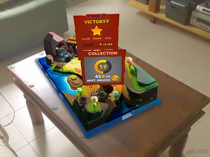
This 3D menu that you can see after you finish a match shows the game’s statistics but also has three buttons. The reason why this design works is that the entire game area is visible to the player so you can’t miss the pop-out menu. Even if you move closer to the game board, your focus is almost always on the center stage, so you can’t miss it. Furthermore, the developer made sure that those pop-out overlays will rotate so you can see them from any angle.
Some other information like the score, the health bar, the timer and other gameplay statistics were visible on-screen not in 3D, so you can always see them no matter where you focus the camera at.
Let me ask you a question: Where you would put the “Start a Game” button, as a 3D overlay or on-screen just in front of the player?
Obviously, it depends on the specific design of the game. For example, in Toy Clash AR I clicked a level button in a 3D menu. I didn’t need to look for it because this is a tabletop game so it’s not like I am going to miss or anything.
If you developer a large game with a large level that plays in like 360 degrees, I think the best way is to position the play button on-screen so the player can see it no matter where he or she looks.
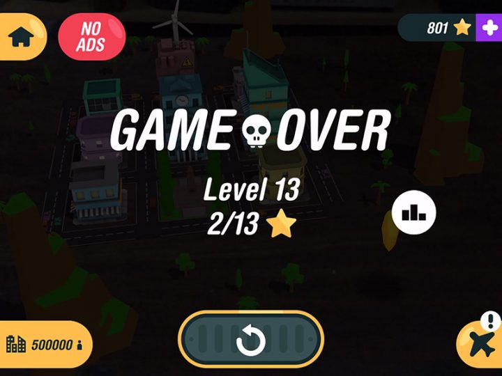
Today I’ve played a game called ARcade Plane. I really like the UI in this game, very simple, clean and one the follows the conventional on-screen approach.

As you can see, there is no way you can not know the game is over and where the replay button is, everything is right in front of you. The same goes when you start the game, the game’s state is always visible to the player, you don’t need to look for it.
Of course, the debate here is only for AR games. Some developers are tempting in adding some of the UI in 3D because it looks more interesting and unique compared to the regular approach.
The focus should be on the user experience (UX). This is much more important than having a beautiful and unique user interface. Users will just leave a game with a bad user experience. I have the patience for a game with a bad UX because I review AR apps but the user won’t.
Had I had to develop a game, I would certainly take a look at similar games from leading companies and see what type of UI they used. It’s different from game to game but the important thing here is to maintain a great user experience.
In my experience, unlike in VR where the entire field of view is visualized, it didn’t impair the experience. My focus was still on the game, I can see the information I needed and interact with the button quickly and easily.
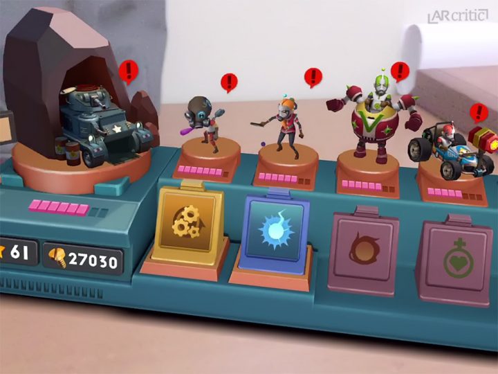
Just take a look at the amazing UI for the main menu of Toy Clash AR.
As you can see, this is not an ordinary UI, it was designed really well to match the medium its run on. Augmented Reality. The game developer could easily go with a flat on-screen UI, but this definitely looks and feel much better in AR.
The main problem I have with an on-screen UI is that it disconnects you from the AR experience. It feels like someone suddenly put a commercial in front of your face as you are enjoying a movie. That UI like in Toy clash AR creates a more consistent and fluid user experience that continues the AR experience outside of the actual gameplay.
IOf course thing might look completely different depends on the game you are developing. I am more interested to hear how you approach this as a developer,. By the way, this discussion isn’t limited only to games, but for any type of augmented reality app. WI am interested to know what resolution you came up with and how you’ve implemented it in your own AR game?


